
JARGONFREE Compass Style Guide
NB. Mobile view has not been implemented yet.
The “Compass” publication has its own distinct style, apart from – but based on and closely related to – JARGONFREE styles used before (a “sub-brand” of the research group, optimized for the online use). The visual connection to the research group as a whole will be introduced through the work-in-progress user interface; e.g. page footers carrying the logo etc.
The core design drivers for content and implementation are: actionability, legibility, simplicity, usability, privacy, accessibility, sustainability (…and probably a range of other -bilities?).
Language/Writing
- Primarily “you”
- British spelling (incl. -ise-endings), use of Oxford-comma
- Headings not capitalized (“sentence style”)
- Tone of voice:
- clear
- general, non-academic language
- expert text, but not dry
- short sentence structures
- Use of illustrations where possible
Fonts
All fonts are open source, with unrestricted use (SIL Open Font License).
-
Main typeface for body text: Atkinson Hyperlegible Next (“These carefully crafted fonts feature clear, highly distinctive letters and numbers that make reading easier and more accessible.”) It comes with a fixed-width variant for citations: Atkinson Hyperlegible Mono
-
Pairing font for headlines and similar: Charis (“Charis is optimized for readability in long printed documents. It is highly readable and holds up well in less-than-ideal reproduction environments due to its simple and robust design with strong serifs and clear features.”)
-
Callout and branding font, used in the logo and for take-aways presented by the compass mascot: Caveat Brush (“Caveat is a handwriting type family designed by Pablo Impallari. It is designed for short annotations.”)
Colour scheme
Derived from the colours used in the original JARGONFREE group logo, extended with an additional alert colour and some darker variants for text on bright background. Colour combinations hidden from the table cannot be used due to low contrast (cf. WCAG; see Accessible Color Matrix and Contrast Grid).
| #012c33on #012c33 | #26a0a1 (brand)on #012c33 |
#1a7070on #012c33 | #68c64a (secondary)on #012c33 |
#316520on #012c33 | #d1747a (alert)on #012c33 |
#b43c44on #012c33 | #e6e6e6 (background)on #012c33 |
| #012c33 (text)on #26a0a1 |
#26a0a1on #26a0a1 | #1a7070on #26a0a1 | #68c64aon #26a0a1 | #316520on #26a0a1 | #d1747aon #26a0a1 | #b43c44on #26a0a1 | #e6e6e6on #26a0a1 |
| #012c33on #68c64a | #26a0a1on #68c64a | #1a7070on #68c64a | #68c64aon #68c64a | #316520on #68c64a | #d1747aon #68c64a | #b43c44on #68c64a | #e6e6e6on #68c64a |
| #012c33on #d1747a | #26a0a1on #d1747a | #1a7070on #d1747a | #68c64aon #d1747a | #316520on #d1747a | #d1747aon #d1747a | #b43c44on #d1747a | #e6e6e6on #d1747a |
| #012c33on #e6e6e6 | #26a0a1on #e6e6e6 | #1a7070 (brand darker)on #e6e6e6 |
#68c64aon #e6e6e6 | #316520 (secondary darker)on #e6e6e6 |
#d1747aon #e6e6e6 | #b43c44 (alert darker)on #e6e6e6 |
#e6e6e6on #e6e6e6 |
| #012c33on #ffffff | #26a0a1on #ffffff | #1a7070on #ffffff | #68c64aon #ffffff | #316520on #ffffff | #d1747aon #ffffff | #b43c44on #ffffff | #e6e6e6on #ffffff |
The default is dark blue text on gray background, with a white background used inside some boxed elements. Turquoise, green and red are mostly used as highlight elements, not as a background (for coloured text on grey/white background,the darker colour versions have to be used). The inverted (on dark blue background) variant is very dominant and is primarily intended for smaller UI elements or footers etc.
Mascots
Compass ("Kompis")

The compass mascot is our brand embassador. It is represented in the logotype and appears in all contexts where particularly important knowledge is highlighted, or take-aways are summarized.
Pen ("Kynis")

The pen mascot represents the linguist/writer and contract designer, reminding practitioners of important linguistic or presentational aspects as they create documents or templates.
Our mascots are created in a vector graphic format where it is easy to create different versions (even small animations would be possible).


Download selected mascot icons for use in Powerpoint presentations etc. (SVG vector files and PNG files with transparent background; version 2026-01-26)
Logotype
The logotype combines the compass mascot with the name of the publication:
This ZIP file (download link) contains the logotype in various coulour combinations as PNG graphics.
The original logo of the JARGONFREE research group will be presented in due manner (tbd.; for sure when presenting the group itself on the home page and in the “About” section, but maybe also in a page footer along with the university/funder logos?)
Icons
Susty Icons align well with out values, provide 739 different icons and are free to use, with attribution optional (“Simple, smart, and scalable vector graphics for a speedy and sustainable web.”).
Our custom-made mascots will be integrated with the icon library, so they can be used in the same way.
Reusable elements in all content
“Scoped paragraphs” with category icons
Text paragraphs can be marked with additional icons to indicate their geographical scope:
This paragraph is only relevant for readers in EU jurisdictions and therefore marked with a map icon (this could also be used for other geographical areas, with text adjusted accordingly).
The following paragraph however has a global scope – it is marked with a globe icon.
Paragraph with crosslink
This is a paragraph that refers to a topic that is covered elsewhere (e.g. a problem description in module III that comes with a proposed solution in module IV).
Layered content
Content can be hidden in expandable elements for layering:
Blockquote
Simple blockquotes can be used to add verbatim citations in the text body:
Ab quisquam earum sapiente eligendi reiciendis impedit. Corrupti necessitatibus ipsa sint error ipsam et. Architecto maiores magni quisquam molestiae saepe. Nemo provident vero nam sit error. Voluptatem corrupti architecto et.
Callout
Highlighted text with a bold main statement (ideally limited to one sentence, or two short ones):
Making contracts work better does not require rewriting everything.
Optionally additional text in regular print:
Making contracts work better does not require rewriting everything.
Small, targeted improvements in how commitments are defined, structured, and communicated can significantly improve implementation and outcomes.
Language/presentation advice
Highlighted text to highlight linguistic or design-related advice:
Eum qui laudantium exercitationem et est. Numquam temporibus cumque sit necessitatibus dignissimos voluptates. Fugiat quia quia iure voluptatem molestias dolor. Minima voluptas provident pariatur. Velit soluta sed adipisci voluptatibus nulla ut saepe id.
-
Possimus non in eos ut cupiditate quibusdam iste.
-
Expedita reprehenderit inventore fugit quam quo non.
-
Quae eius at iusto sunt dolores et.
Ut fuga nulla error voluptatibus dignissimos beatae. Ut vel aperiam expedita. Nobis natus sint aperiam. Nesciunt laudantium corporis asperiores atque. Quo labore dignissimos animi occaecati enim nisi delectus totam. Est eius vitae consequatur eum sit aut omnis soluta.
Glossary
Any terminology the readers may not know or wish to learn more about can be linked to our centralized glossary. Terminology can be explained in two different ways:
The lightweight variant is for terminology that is not crucial for understanding the topic at hand but may be unfamiliar to some readers. For example the term hard law may be used in a text, but we deem it not critical enough in itself to actually embed an explainer box.
In the more verbose format, a newly introduced term is explained in a separate box:
Due diligence
This is suitable for terms that we really want the readers to embrace and adopt.
We can write a paragraph or two here, and readers can click on a link to open the pop-up for more details.
Images
By default, an embedded image appears at the same width as the text column (for now: 600px, but image files would ideally have a resolution of 1200px to accommodate high resolution screens; users can enlarge images by clicking on the according icon):

It is also possible to embed series of images as a gallery, which for example enables a simple “manual animation” to explain a process:
Of course custom solutions can be found for all other image requirements.
External resource
A link to a resource elsewhere:
Box
Generic box to frame some content outside of the main text flow; e.g. for short listings. This is for slightly bigger chunks of content than the callout. Think of it as a little cheat sheet someone could print out and put on their wall.
Plain language makes better business
A clear contract is a business tool. Plain language:
-
Reduces misunderstandings and disputes by making expectations, responsibilities, and monitoring requirements obvious rather than implicit.
-
Improves supplier relationships, especially with SMEs that may not have the legal capacity to interpret dense or ambiguous requirements.
-
Speeds up negotiations, because fewer clauses require interpretation, internal consultation or “translation” between functions.
-
Supports the implementation of sustainability commitments, as the commitments become more actionable and easier to operationalize (people actually understand what they must report, provide or change in their operations).
When using the optional icon as a marker for the box, its use should be consistent with a small number of pre-defined icons with a specific meaning (TODO).
Expandable box
A layering element, where some text is initially visible and more can be revealed on user interaction:
Expander
Quiz/Minigame (“aktivointihetki”)
Small interactive widgets where users can take a quiz or simliar. Very minimalist example:
What level of commitment does this represent?
"The Supplier acknowledges the importance of respecting human rights and shall use commercially reasonable efforts to ensure that its operations do not involve forced labour."
Explanation why it's an obligation
For a complete testbed of all intended elements, see here
Embedded video
Elements to be added to this styleguide
Interactive examples
Small interactive widget that shows an example that can be tampered with
Downloadable content
Presentation of PDF or other resources that can be downloaded from our compass (not an external source; use the “External resource” element instead)
Key take-aways
A summary of key points for each module. A variant of the callout, featuring both the mascots, to avoid confusing users with too many different element styles:

Key take-aways
- Est quis occaecati et rem alias. Aut exercitationem qui et. Facere aut sequi doloribus.
- Aspernatur amet id qui non neque. Impedit odit totam repellat eum et nobis. Consequatur earum maxime sed et deleniti.
- Ex voluptatibus quod odio odio quibusdam non commodi fuga.
…plus, maybe, a download link to retrieve a printable version for the office wall?
More…
Additional element types will be added as the content matures.
Terminology note
Terms to avoid vs. terms to use (living document; add new ones in Google Drive here).
| Legal or governance-heavy language to avoid | Recommended language |
|---|---|
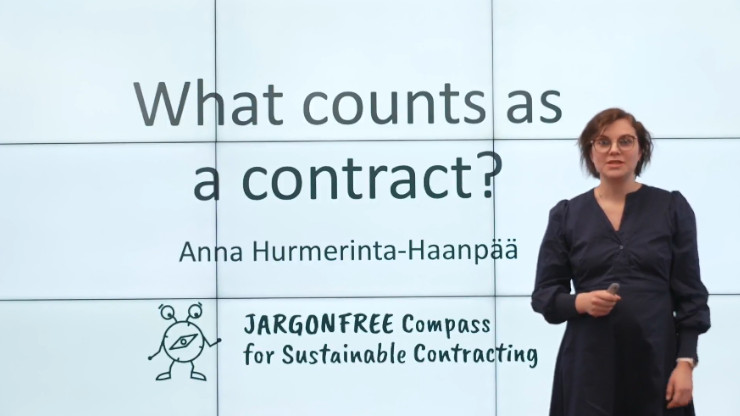
| What constitutes a contract? | What counts as ‘the contract’? |
| Contracts as governance tools 1 | Contracts as business or management tools |
| Value chain 2 | Supply chain (preferred in Modules 2-4) |
| Legal act / juridical act (oikeustoimi) | Action with legal effect |
| Unilateral legal act | One-sided commitment |
-
Governance tool kuulostaa (keskus)hallinnon ja compliance-funktion asialta, etäännyttää operatiivista johtoa ja liiketoimintaa eikä istu hankinnan tai liiketoimintajohdon kieleen. ↩︎
-
Value chain toimii säädöskontekstissa, mutta yrityskielessä supply chain on tutumpi ja toimivampi. Jos halutaan selventää, miksi termi vaihtuu mod 1 jälkeen, voidaan todeta esim. tähän tapaan: In the CSDDD, value chain is used. In the Compass, we use supply chain to reflect business and contract practice. Ja meille itsellemme Style Guideen voidaan laittaa muistutus: Terminology is a design choice. In the Compass, terms are selected to support understanding, usability, actionability and real-world implementation in business practice. Where regulatory or legal terminology differs from business language, the Compass prioritises terms that resonate with companies’ day-to-day decision-making and management practices. ↩︎